The Bureau of Meteorology (BOM) has rolled out a major update to its official weather website, intending to modernize the platform and improve user experience. However, the redesign has triggered a significant BOM website redesign backlash, with Australians across the country criticizing missing features, slower navigation, and a less intuitive interface. As weather information is critical in a nation prone to fires, floods, storms, and heatwaves, many users are demanding immediate fixes. In this article, we break down what went wrong, why the backlash is intensifying, and how the BOM is responding.
What Sparked the BOM Website Redesign Backlash?
The bureau launched its newly redesigned website with the promise of a cleaner look, better forecasts, and an improved mobile experience. However, within hours of the launch, users took to social media platforms, including X (formerly Twitter), Facebook, and Reddit, expressing shock and disbelief. Many felt that the platform had become harder to use.
- Missing or harder-to-find local weather details
- Inaccurate or slow-loading radar maps
- Essential features buried deep within menus
- Poor accessibility for elderly or vision-impaired users
- A layout that feels “too crowded and confusing”
The Importance of BOM in Australian Daily Life
The Bureau of Meteorology is not just another government service—it is a critical part of Australia’s emergency response ecosystem. From predicting cyclones in Queensland to tracking bushfires in New South Wales and heatwaves in South Australia, Australians depend on its data every single day.

Because of this, even minor adjustments to the website can have significant national consequences. For many citizens, the redesign feels like a downgrade rather than an upgrade, fueling the BOM website redesign backlash.
What Users Say Is Wrong With the New Design
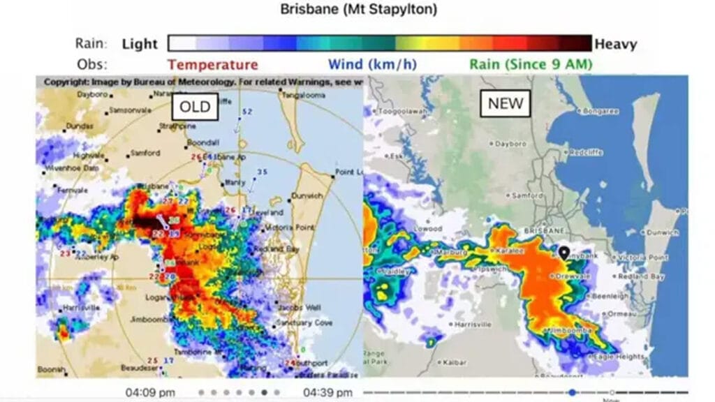
1. Radar Functionality Problems
Real-time radar data is one of the most visited sections of the website. During storms and cyclones, this feature becomes even more important. After the redesign, many users have reported blank radar screens, slow loading, or buttons that don’t respond.
2. Too Much Scrolling Needed
Users say common features like hourly forecasts or seven-day outlooks require unnecessary scrolling. The layout feels “spread out,” forcing users to hunt for information that used to be instantly accessible.

3. Accessibility Issues
Vision-impaired users have complained that contrast levels are insufficient and that font sizes are inconsistent. Elderly users, who heavily rely on the BOM website, also say the new interface is “too modern” and difficult to navigate.
4. Broken or Moved Features
Some features—such as detailed observations, wind speed graphs, and rainfall totals—appear to be missing or buried under multiple submenus. This has caused widespread frustration, especially among farmers, pilots, emergency responders, and outdoor workers.
How the BOM Responded to the Redesign Backlash
In response to the mounting criticism, the Bureau of Meteorology issued a public statement explaining that the redesign aimed to make the site compatible with future upgrades. They assured Australians that missing features would reappear in upcoming updates.

- Radar issues are being investigated.
- The user interface will receive tweaks based on feedback.
- Accessibility compliance will be prioritized.
- The previous website cannot be restored, as it is no longer supported technically.
Experts Weigh In: What Went Wrong?
UX specialists and tech analysts have also shared their views. According to design experts, the new layout appears to place aesthetics over functionality. They note that weather websites should prioritize clarity, simplicity, and speed above modern styling.
Some experts believe the BOM may have rushed the redesign to meet federal digital modernization deadlines, sacrificing usability in the process. Others argue that government websites often fail to undergo real-world testing with actual users, especially those in remote or disaster-prone regions.
Public Reaction on Social Media
Social media platforms are filled with memes, jokes, and angry posts criticizing the redesign. One viral post compared the new layout to a “1990s travel brochure,” while another said it looked like a “student project rushed the night before submission.”
यह भी पढ़े:
 Samsung Bixby Perplexity AI Integration: 7 Key Signs Samsung Is Reinventing Its Voice Assistant
Why the Backlash Matters
The BOM website redesign backlash highlights the importance of user-centered design in government digital services. Weather data is not entertainment—it is life-saving information. When people cannot access critical details quickly, the consequences can be severe.
You can also read authoritative weather and climate data directly from the Bureau of Meteorology.
Will BOM Fix the Issues Soon?
The good news is that the BOM has promised rapid updates. Developers are currently working on restoring missing features and improving stability. However, full fixes may take several weeks or months.

Conclusion
The BOM website redesign backlash shows how deeply Australians depend on the Bureau of Meteorology’s services. While modernization is essential, any update must prioritize usability, accessibility, and speed—especially in a country where extreme weather is a constant threat. As the BOM works to resolve issues, users hope that the final product will combine modern design with the reliability they’ve always counted on.